UX Design - Le Café App
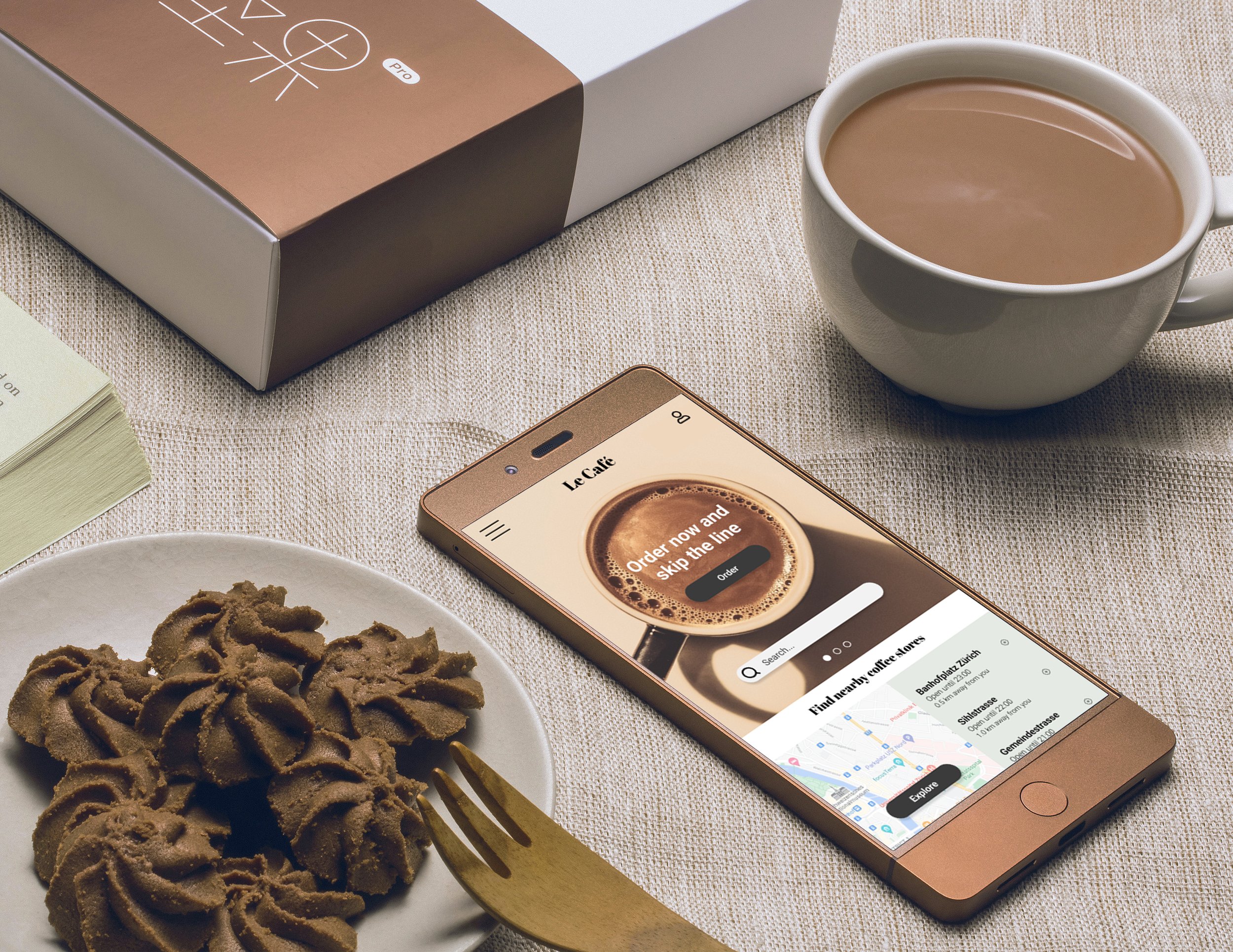
Le Café is a chain of coffee shops with several locations across Switzerland. Le Café delivers artisanal coffee and has a delicious variety of food options to accompany it. The coffee stores offer a calm and cozy atmosphere and have the option to eat in or take out.
My role: UX and Visual Designer from conception to delivery.
Responsibilities: User research, paper and digital wireframing, low and high-fidelity prototyping, conducting usability studies, accounting for accessibility, and iterating on designs.
Project duration: November 2021–February 2022.

The problem
Customers want to place their order and skip the line at the coffee store
The goal
Design an app for Le Café to help customers place their order through the app and skip the line,
with options for pick-up and in-store table delivery
User Research: Summary
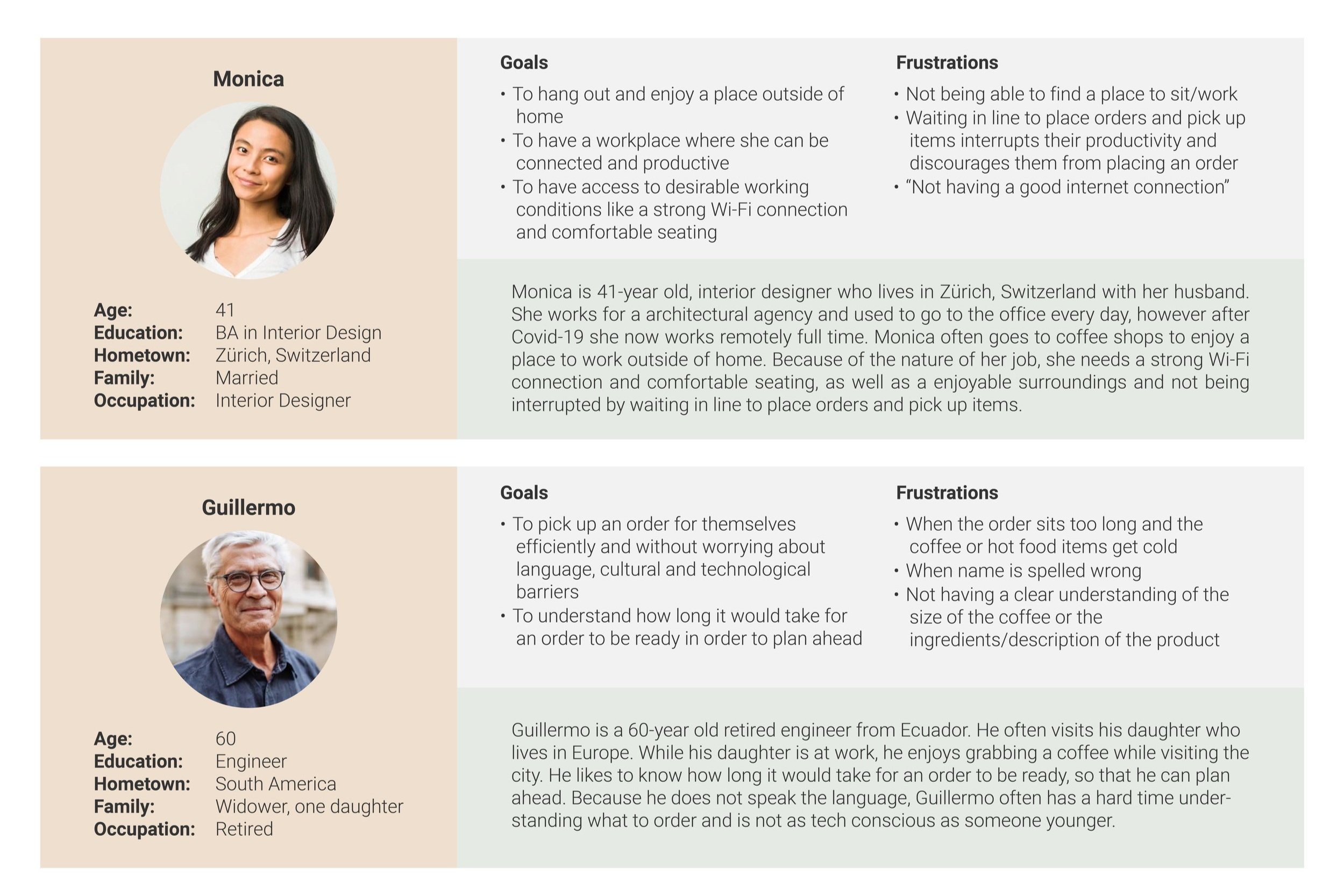
I conducted interviews and created empathy maps to understand the user’s needs and frustrations. A primary user group identified through research was students and working adults who like to study and work in coffee shops. This user group confirmed initial assumptions about the coffee shop’s customers, however, research also revealed that there are many other needs when choosing a coffee shop, such as time spent waiting in line, number of people and availability of seats, diversity of products and offering of hot snacks and desserts, Wi-Fi or good internet connection, decorations/look and feel, language and cultural barriers.
user pain points

user personas
User Journey
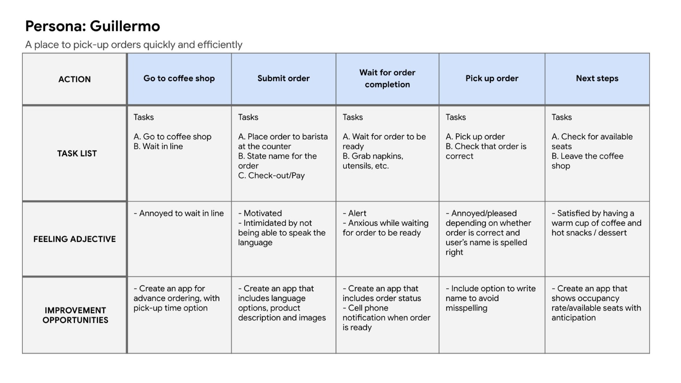
Mapping Guillermo’s user journey revealed how helpful it would be for users to have access to a dedicated coffee shop app.
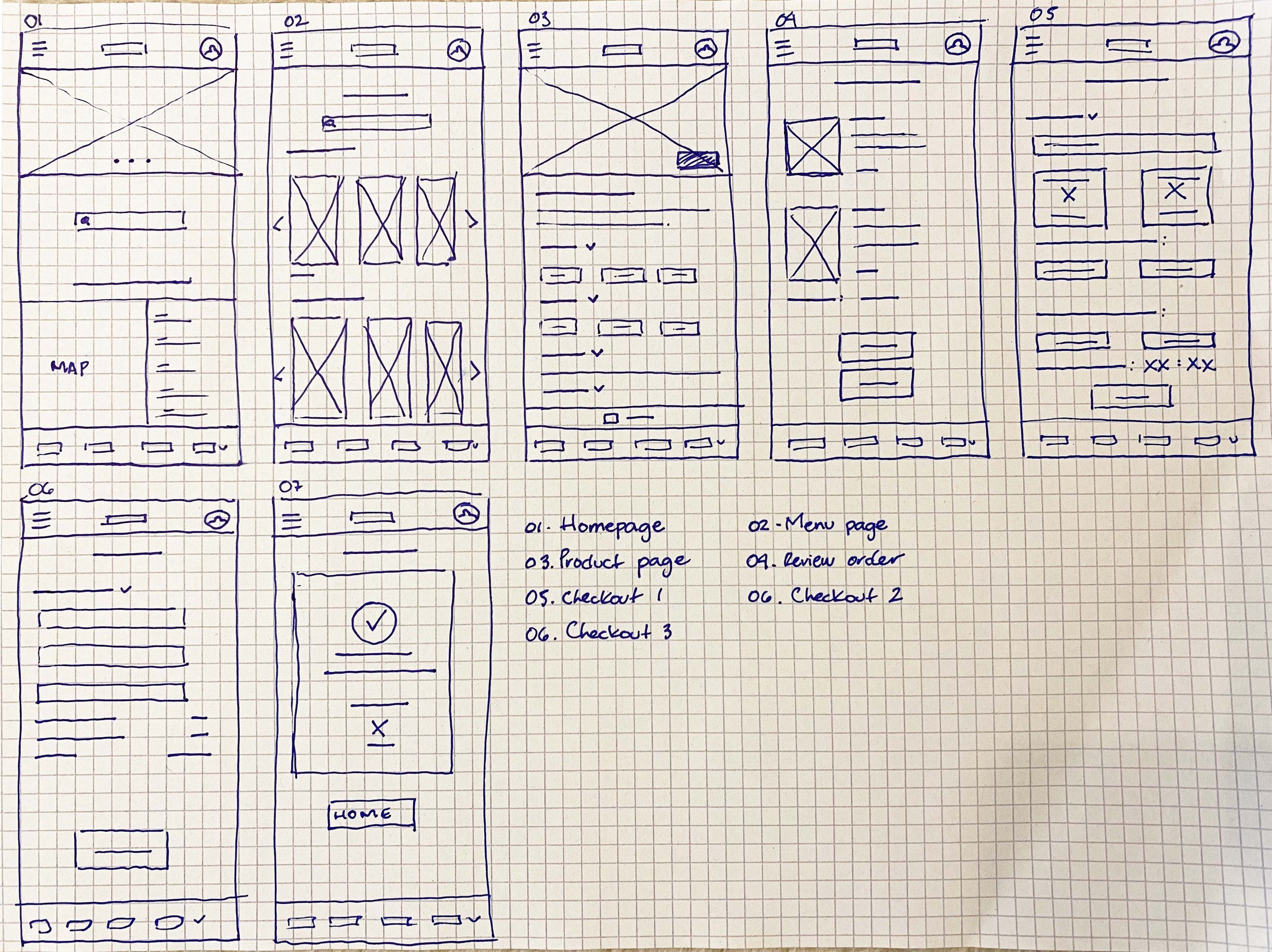
Paper
wireframes
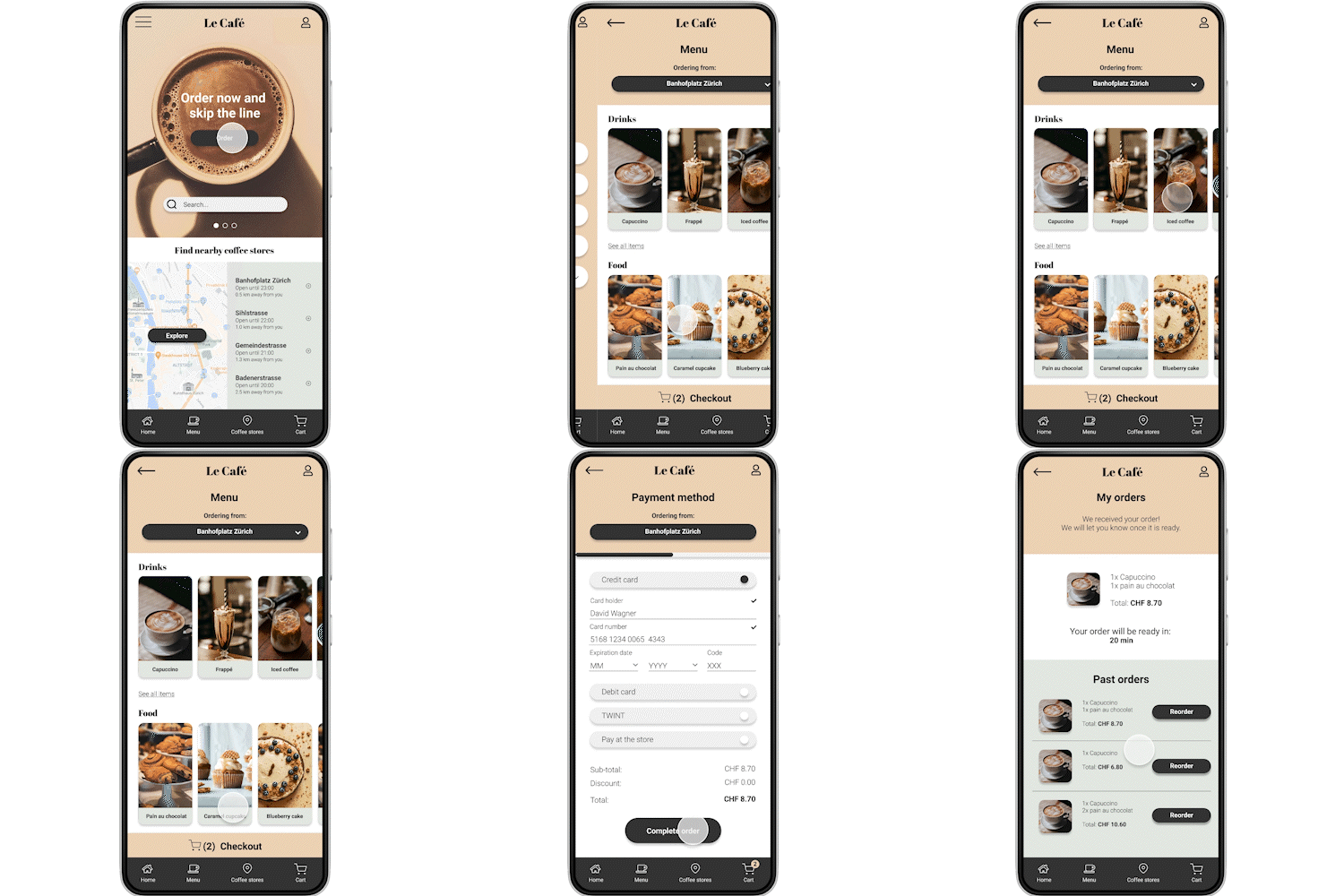
Paper wireframes were very helpful in identifying solutions for easy navigation and a good user flow, prioritizing feedback and pain points that emerged from user research.
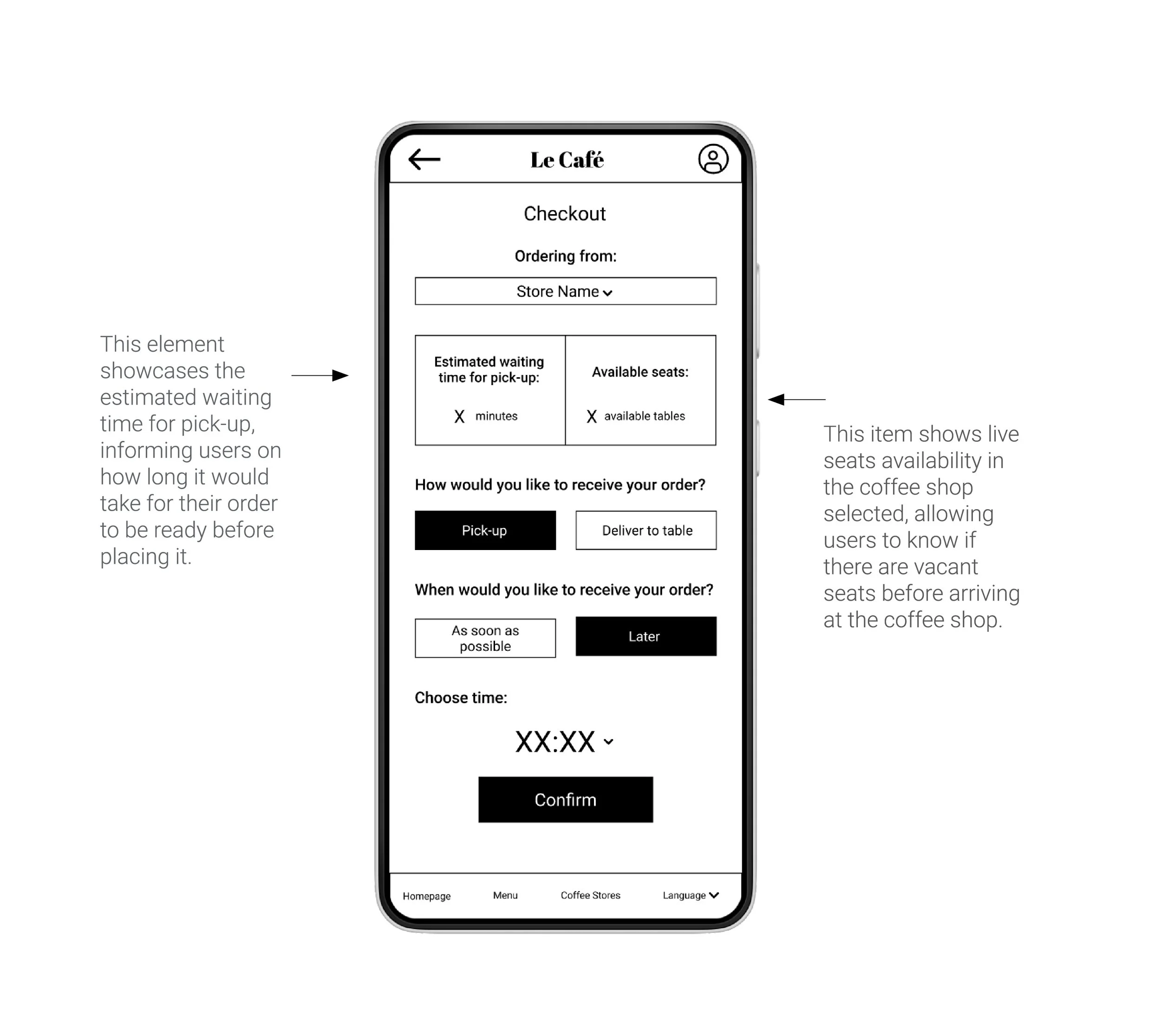
Digital wireframes
I made sure to incorporate potential solutions to pain points that came up during the user research, such as waiting in line for too long and a lack of available seats.
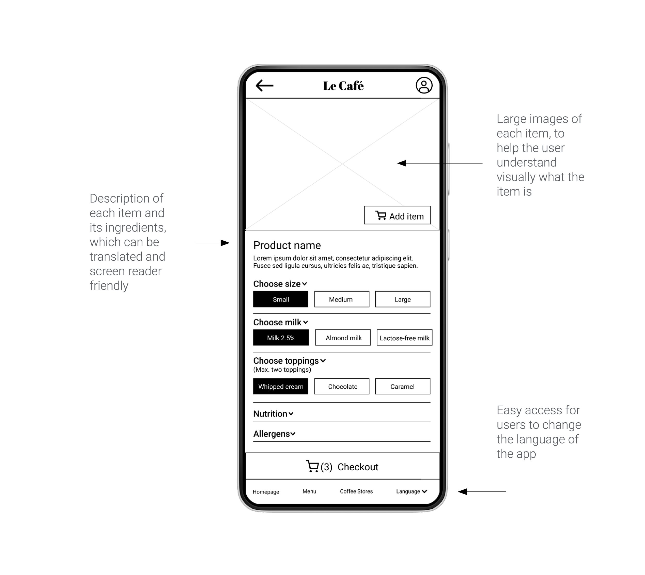
Digital wireframes
Inclusiveness was another important element when working on the app design, such as addressing pain points of users who may not speak the language, need assistive technologies, or simply not be as tech-conscious as someone younger.
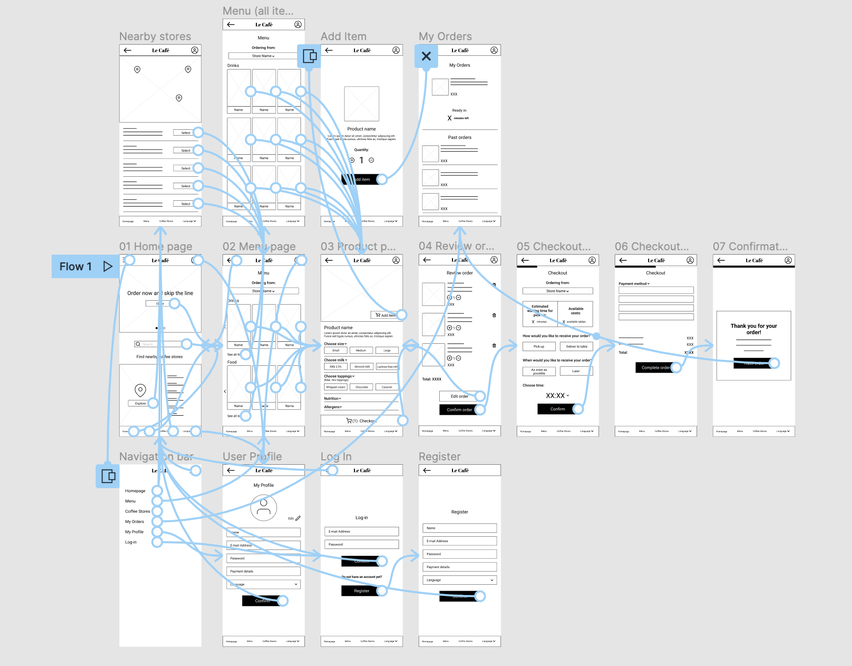
conducting usability studies
How long does it take for a user to find a coffee shop and place an order?
What can we deduce from the steps that users take to place an order?
Are there more features that users would like to see included in the app?
Are there any parts of the app that users find difficult to use?
After creating the prototype from low fidelity wireframes, a usability study was conducted with participants who are frequent customers of coffee shops, to determine if users can complete core tasks within the app prototype and to spot any challenges or difficulties in using the app. Participants were given a list of tasks to complete and asked to fill a System Usability Scale. The study helped gathering important feedback which was used for the following design iterations.
Round 1 findings
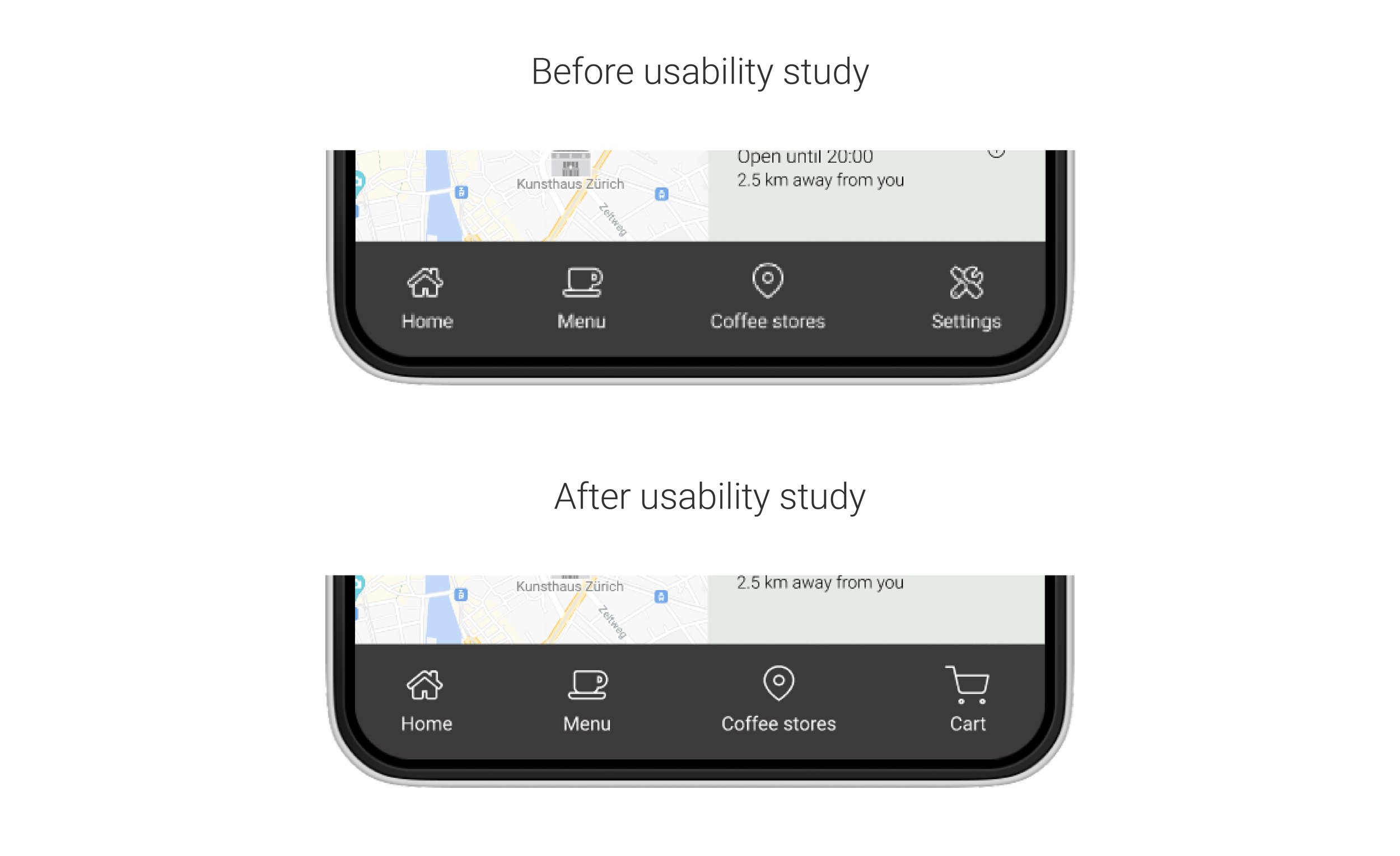
The first usability study showed that users wanted to checkout from any page in the app. A cart icon was included on the bottom navigation bar to help users checkout more easily. The previous settings page can still be accessed through the profile icon on the top-right.
Other findings, which were addressed in the next set of design iterations, included users wanting to see the menu page after adding an item to the cart and the option to pay with cash during checkout.
Round 2 findings
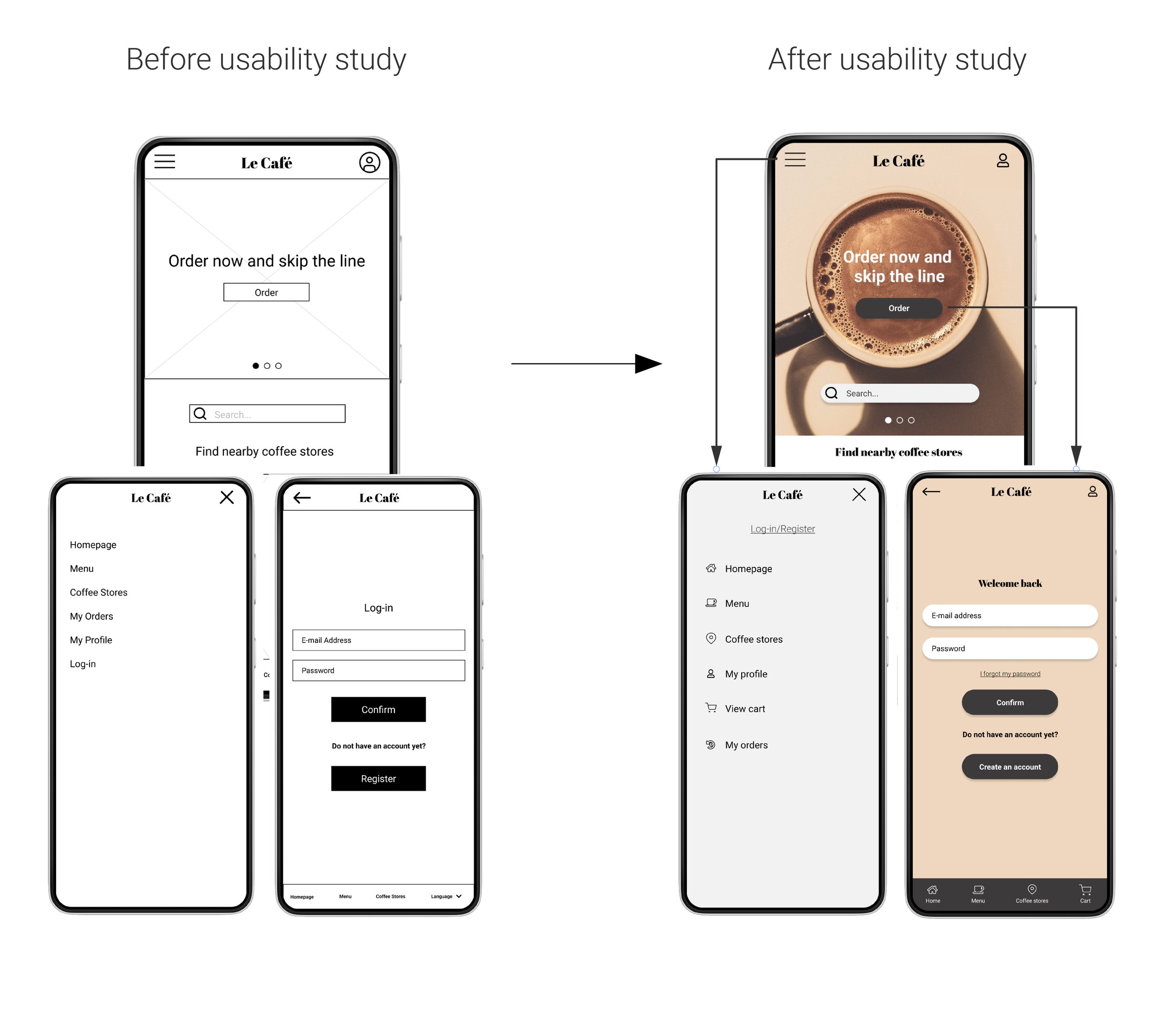
The second usability study showed users’ challenges when trying to create an account. To make it easier, the designed was adapted to open the registration page when clicking the order button on the homepage and adding an option in the navigation bar.

Accessibility considerations
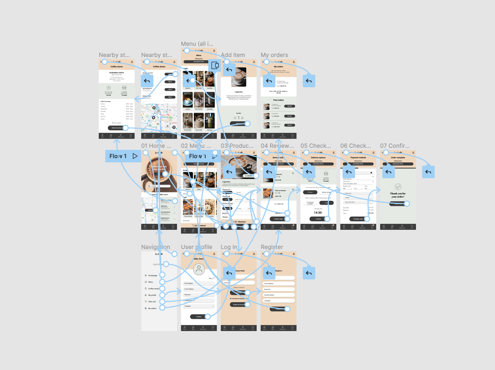
• Inclusion of iconography throughout the app navigation bars, homepage, coffee stores locator page, product page, review order page, delivery options and checkout pages
• The combination of colors used for the color palette of the app corresponds to accessibility standards
• Accessibility has also been considered for gestures and motions in the app, as well as the use of imagery and easy access to language options at the top navigation bar
takeaways
Being my first UX Design case study project, and having to cover the entire design process on my own has made this journey a very special one. At the same time, it has taught me a lot about the user journey and the importance of making decisions that are not based on personal assumptions, but on research to back them up. Another very important learning lesson is accessibility considerations. I spent a lot of time learning and applying these concepts to make sure the app was accessible and to make sure a diverse group of people were represented when conducting research.